

Siwa Protein Bars
PACKAGING DESIGN
Client: Siwa - Suomen Lahikauppa | www.siwa.fi | Market: Finland | Year: 2015


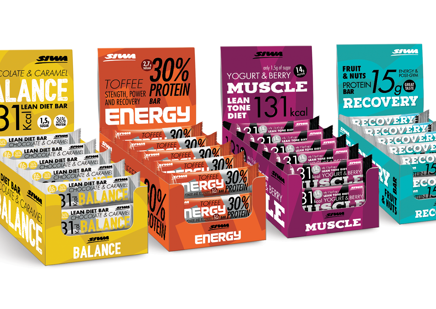
For SIWA’s Protein Bars we want to highlight movement, dynamism and strength between typography and colors. Movement and color comprise the emotional part of the design while the reinforcement of product features speak to functionality and proficiency. The backgrounds are made with the first letter of each SKU, conveying the power and strength of sports and fitness. Each product is unique and targets a different consumer: Balance, Muscle, Recovery and Energy.
The design approach aims to create a range of products, while giving a twist on each product: this is the essence of the House of Concepts. In this specific range it is crucial to create the idea of a family, even though each product is treated in a different way. The family brings the idea of expertise in the protein domain and the twist on each product guarantees needed variety. The result is a dynamic solution that connects with athletes and sports-lovers by transmitting a message of hard work and a healthy life. Strength, movement, efficiency, results, power and health are our key words.
Creative Direction: Jens Sievert
Design: Inês de Almeida Batista
Account Executive: Margarida Lacerda


